A nice game on preparing the frequency table using tally mark.
|
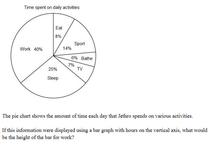
Create the bargraph of the data you have collected...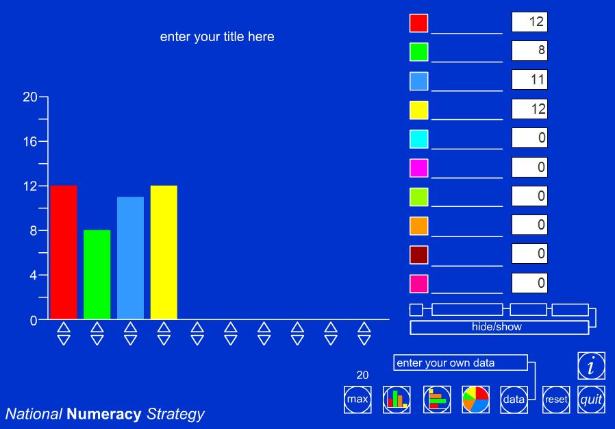
|
Misleading Graphs : As well as providing valuable evidence to support your finding, statistics can be misleading. They are often used to prove a point, and can easily be twisted in favour of that point. Here are some examples of misleading graphs. Observe each graph . Do not forget to post your answers in the resprctive wall wisher as it will be assessed by you teacher.
Question 1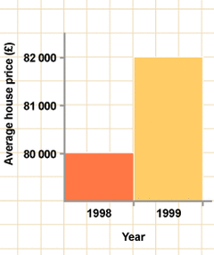
What is wrong with this bar chart? How should the information be represented?
Question 2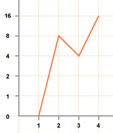
What is wrong with this line graph ? Suggest the changes for the correct information be represented?
6M.
|
Question 3.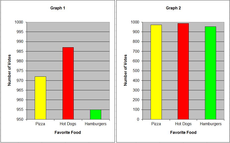
Two different bar graphs are made from the same survey of food favorites. Which graph do you think is better? More fair? Why? Click on the wall wisher link to post your answer .
Draw the correct graph representing Question 2 and submit to your Math teacher. |


Quiz :Bargraph